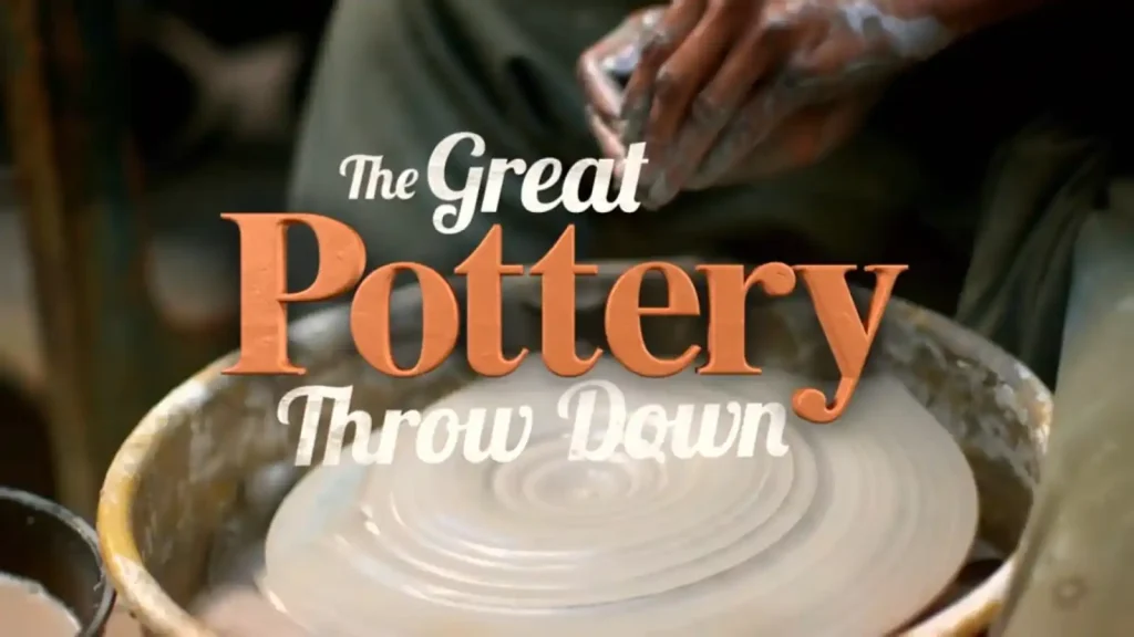
The Great Pottery Throw Down 2026 episode 5 brought seaside nostalgia crashing into the competition as eight talented potters faced the demanding task of creating retro souvenir sets inspired by beloved British coastal towns. Week five marked the halfway point of this intense ceramics competition, and the stakes had never felt higher for the remaining contestants. Inside the historic Gladstone Museum, where pottery traditions have flourished for generations, these makers prepared to demonstrate their versatility across multiple disciplines. Keith Brymer Jones and co-judge Rich Miller stood ready to evaluate not just technical prowess but also the emotional resonance of each piece.
The significance of this particular challenge extended beyond mere craftsmanship. Souvenir pottery represents a uniquely British tradition, connecting generations through tangible reminders of cherished holidays and family memories. The potters faced the considerable task of producing four distinct pieces within six hours: a tankard, a bell, a large ribbon plate, and one additional item chosen from a conch shell, clog, or wheelbarrow. Each element demanded different skills, from precise throwing to delicate hand-building, testing the competitors’ ability to adapt quickly under pressure.
Rich Miller acknowledged the deceptive complexity of the main make challenge. Though the individual items appeared straightforward, the technical aspects proved formidable. The judges specifically requested sprig decoration, piercing work, and surface embellishment that would transform simple vessels into cohesive keepsakes. The ribbon plate alone presented significant difficulties, as any piercing around the rim risked compromising the structural integrity of the already stress-prone form. Furthermore, applying large sprigs to curved surfaces like tankards created potential for air pockets that could cause catastrophic failures during firing.
The Great Pottery Throw Down 2026 episode 5 revealed the deep personal connections potters brought to their creations. Each contestant selected a seaside town carrying profound meaning, transforming the technical exercise into an emotional journey through family history and cherished memories. The atmosphere in the Gladstone Museum crackled with creative energy as wheels spun and hands shaped clay into vessels meant to capture the essence of British coastal life.
Keith Brymer Jones emphasised that week five demanded impressive results. The competition had reached its midpoint, eliminating casual observers and leaving only serious contenders. Both judges expressed eagerness to see the stories potters would tell through their decorative choices, seeking work that would genuinely evoke smiles while meeting rigorous technical standards. The pottery tradition represented here carried weight that transcended the competition itself.
The additional spotlight challenge added another layer of complexity to an already demanding week. Potters would need to demonstrate their turning skills by crafting a trio of candlestick holders from solid leather-hard clay cones. This blind-judged test required precision, speed, and an understanding of proportion that would separate confident makers from struggling amateurs. The twenty-minute time limit left no room for hesitation.
The personal stories embedded within each souvenir set provided emotional counterweight to the technical demands. From grandmothers paddling in Dorset waters to mothers shepherding children on Newcastle beaches, these pieces carried the weight of family histories. The ceramics became vessels not just for practical use but for preserving memories that might otherwise fade with time.
Throughout the making process, the historic setting of the Gladstone Museum reminded everyone present of pottery’s enduring cultural significance. The competition unfolded in spaces where countless craftspeople had shaped clay before, lending gravitas to each throw and every decorative flourish. The Great Pottery Throw Down 2026 episode 5 would ultimately test whether these amateur potters could honour that legacy while meeting the exacting standards of professional judges.
The Great Pottery Throw Down 2026 episode 5
Personal Stories Behind Seaside Town Selections in The Great Pottery Throw Down 2026 Episode 5
Andrew chose Swanage on the Dorset coast, drawing directly from childhood holidays with his family. His father had been born in nearby Lulworth, making the Jurassic Coast a place of deep personal significance. Andrew designed his bell with particular cleverness, sculpting the famous Durdle Door rock formation as the handle. This geological landmark, transformed into a functional doorbell, represented exactly the kind of wordplay the judges appreciated. His commemorative tankard paid tribute to his grandmother, featuring a sprig depicting her paddling in the sea during the 1930s.
Andrew explained that his grandmother had been instrumental in raising him and his siblings when their mother was unwell. The image of her dipping her toes in the water captured a cherished memory, representing as far into the sea as anyone could ever convince her to venture. However, Andrew admitted nervousness about his sprig-making abilities, having never attempted this technique before. The risk of air pockets beneath the decorative elements could cause them to pop off during firing.
Bill also selected the Swanage area, creating what he described as the Battle of Dorset between himself and Andrew. His wheelbarrow design would contain familiar beach day items including a bucket, spade, ammonite fossil, hat, and crab. The family holidays that inspired his work included his mother, father, brother, and grandmother. When pressed about whether he enjoyed these family trips, Bill hesitated momentarily before confirming he did, though certain family members proved somewhat annoying.
Anne Harrod stayed closer to home, choosing Porthcawl in South Wales. This seaside town sat merely ten minutes from where she grew up, featuring a fairground that had operated since the early 1900s. The personal connection ran even deeper through family history. Anne Harrod revealed that her grandmother’s mother had worked summers on the ghost train at that very fairground. Her bell would transform into a vintage helter-skelter, while her tankard and plate served as canvases for 1950s picture-postcard illustrations of the beach and amusement park.
Emily selected Sidmouth, celebrating the Devon town through multiple family connections. Her clog design referenced her childhood involvement in clog dancing, which she had performed in Sidmouth itself. The bell handle featured a donkey, nodding to the town’s famous donkey sanctuary. Emily shared an extraordinary family story: her great aunt had visited the sanctuary daily to feed ginger biscuits to the donkeys. Shortly before dying, she had revealed winning a substantial sum in a sweepstake. After her death, the family heard on the radio that someone had donated 1.2 million pounds to a donkey sanctuary with the specific request that the donkeys receive ginger biscuits daily.
Naveed dedicated his Folkestone set to his wife Charlotte, who had previously expressed frustration at being overlooked in his pottery dedications. She had bought him his wheel, encouraged his pottery practice, and pushed him to enter the competition. His illustrations featured Charlotte cycling across various Folkestone landmarks, sometimes dangerously close to cliff edges or approaching trains. The phrase “So nice you want to die there” adorned one piece, gaining additional dark humour given Charlotte’s precarious cycling positions.
Technical Challenges of Ribbon Plates and Bell Throwing
The ribbon plate emerged as the most technically demanding component of the souvenir set. This traditional form required potters to throw a wide, flat plate before cutting holes around the rim through which decorative ribbon would later be threaded. Rich Miller explained that plates naturally experience significant stress through their rims, and any action undermining that core structure could cause problems during drying or firing.
Several potters admitted unfamiliarity with the form. Caylee declared she had never encountered a ribbon plate despite her love of kitsch collectables. The piercing process proved particularly nerve-wracking, as each cut weakened the tension holding the plate together. Potters whispered while working, treating their plates with extraordinary care. The risk of warping increased exponentially with every hole punched through the delicate rim.
Finn confessed this represented only the third plate he had ever thrown. His fledgling foray into plate production dedicated itself to his adopted home of Falmouth, incorporating maritime imagery inspired by 1940s and 1950s railway posters and children’s book illustrations. He planned watercolour-style underglazes with black line work, similar to techniques that had earned him Potter of the Week in the competition’s first week. The judges noted that previous success with sets and illustration work boded well for his chances.
Bill approached plate throwing with slightly more experience but similar anxiety. The flat form could crack through S-cracks if not compressed sufficiently during throwing, pulling apart during drying. Everyone understood that larger pieces increased cracking risks, making the substantial dinner-plate-sized forms particularly perilous. Potters compressed their clay repeatedly, hoping to avoid the heartbreak of discovering fatal fractures after firing.
Bell throwing presented opposite challenges. Where plates required thickness for stability, bells demanded thinness for proper resonance. Naveed struggled through four attempts, trying to achieve walls delicate enough to produce a satisfying ring. The judges would test each bell on judging day, expecting clear tones rather than dull thuds. Too thick and the bell would sound muted; too thin and it might collapse entirely during firing.
Caylee took an unconventional approach to her bell design, using Donald Trump as visual inspiration. His distinctive silhouette, with swimming trunks painted in red and white stripes reminiscent of rock candy, would form the bell shape. The unexpected reference generated laughter in the throwing room, though Caylee noted her version showed Trump smiling and being kind, making it clearly fictional.
The Spotlight Challenge and Candlestick Holder Mastery
Rich Miller demonstrated the blind-judged spotlight challenge with characteristic precision. Three solid leather-hard clay cones sat waiting for the potters, each requiring transformation into turned candlestick holders with distinctive bulbous profiles. The master potter explained the technique methodically: centre the cone, pin it down, then use turning tools to carve rounded shapes while maintaining proper proportions.
The largest candlestick required four balls, the medium three, and the smallest two. Rich Miller emphasised working from top to bottom to maintain centrality throughout the turning process. Starting from the bottom risked going off-centre by the time potters reached the top. He demonstrated creating rough marks dividing each cone into even sections before carefully carving each rounded element.
The clay’s consistency created additional complications. Leather-hard on the outside, the material grew progressively softer toward the centre. This gradient meant turning tools could suddenly dig in when reaching softer clay, removing material impossible to replace. Rich Miller counselled slowing down during refinement stages, maintaining conscious awareness of hand positions and tool control.
Twenty minutes proved remarkably constraining for producing three graduated candlesticks. Potters immediately recognised the challenge’s difficulty despite Rich Miller’s smooth demonstration. Caylee questioned whether this suited her skills, noting his facility made everything appear deceptively easy. Getting even spacing and properly curved balls represented the true test, requiring both speed and accuracy that rarely coexisted comfortably.
The potters scattered to their wheels as time began. Some discovered their cones sat reasonably centred while others faced immediate adjustment challenges. Proportional marking without rulers added another difficulty layer. Estimates of halfway points determined ball placement, and small miscalculations compounded into visible irregularities.
Bill achieved focus quickly, entering what he described as getting lost in the turn. The meditative quality of removing clay shavings proved therapeutic, though this relaxation endangered his time management. By the halfway call, most potters had completed only one candlestick with two remaining. Panic spread through the room as makers accelerated their wheels, risking the very accuracy the judges would evaluate.
Anne Harrod found the process satisfying despite time pressure, comparing it to peeling an apple. However, satisfaction did not guarantee speed. As the five-minute warning sounded, several potters remained on their second candlestick with the smallest still untouched. Emily pushed her wheel faster than ever before, somehow keeping her clay from flying off despite the risky speed.
The final minute saw frantic completion attempts. Kaylee’s aggressive turning drew commentary about her transformation into a wild clay woman. The countdown reached zero with mixed results across all eight workstations. Some potters had produced clean trios while others displayed obvious inconsistencies in their rushed final pieces.
Judging the Candlestick Challenge and Establishing Rankings
Keith Brymer Jones and Rich Miller evaluated the anonymous candlestick sets with characteristic thoroughness. The first set displayed nice cone shapes with matching cups, though the middle-sized holder showed somewhat flattened rounded elements. The base ridge could have been more pronounced, but overall the candle wells appeared nicely finished.
The second set included five candlesticks rather than three, with someone adding extras for good measure. However, the cups had gone wayward at the top, and the smallest holder was missing its cup entirely. Moving through subsequent sets, the judges noted pronounced turning on some, confident work on others, and varying degrees of curve retention across the trios.
One set demonstrated really nice turning with beautifully rounded curves on the large holder, though the third ball on the medium piece had been slightly lost. Another showed excellent accuracy between cups, with proportions matching well across all three pieces. The judges specifically praised this set’s coherent feel, noting it appeared as a genuine matched collection rather than three separate attempts.
Set seven earned particularly positive feedback for its clean turning, matching cups, and excellent proportions between sections. The profile looked lovely with very accurate tool work, though the base of the middle candlestick could have been trimmed slightly more. The final set featured beautiful turning with super-clean bases and wonderfully defined rim ridges, though the bottom section on one piece appeared slightly mean in proportion.
The ranking revealed Bill in first place with the cleanest turning and best proportions. Emily claimed second with beautiful shapes across all three candlesticks. Elham secured third position, Finn fourth, and Andrew fifth. Naveed placed sixth, followed by Anne Harrod in seventh. Kaylee finished eighth, primarily due to the missing cup on her smallest candlestick.
Bill expressed surprise at his victory, crediting his ability to zone in and get lost in the turning process. Anne Harrod acknowledged her seventh-place finish with concern, recognising that such positioning made everything dependent on the main make performance. The spotlight challenge results would factor into final judgments, potentially saving or condemning potters based on their accumulated performance across both tests.
Day Two Decoration and the High-Temperature Firing Challenge
The second day began with potters approaching their bisque-fired pieces with mixture of anticipation and anxiety. Princess, the technician responsible for firing, had laid out the souvenir sets under hessian cloths, concealing their fate until the decorating session commenced. Worries centred on sprig adhesion, S-cracks, and general survival through the intense heat of the first firing.
The judges allocated three and a half hours for decoration, which Rich Miller acknowledged might sound generous but would prove demanding. Each ribbon plate required an illustration of the chosen seaside town in its centre, and the judges expected artistic detail worthy of week five competitors. Additionally, the stoneware body would undergo high-temperature glaze firing, affecting colour density significantly. Potters needed multiple layers of underglaze to prevent colours burning out and appearing washed out in the final result.
Relief spread through the room as hessian lifted to reveal largely intact pieces. Finn pronounced his set looking great, impossible to fault. Andrew expressed particular pleasure that everything survived, though his grandmother sprig had required removal at the last minute due to poor construction. He would need to paint her image instead, adding time pressure to an already demanding schedule.
Anne Harrod discovered a small crack around one sprig but otherwise found her pieces emerged reasonably well. The potters had been provided arrays of underglazes and oxides for bringing their sets to life. Finn explained his colour palette as muted watercolour tones with sketchy line work, referencing his Falmouth happy place. Decorating represented meditative work for him, allowing mental zones of comfortable concentration.
The crucial technical consideration involved underglaze application thickness. Keith Brymer Jones and Rich Miller discussed their concerns about potters potentially burning out colours through insufficient coverage. One or two washes might suffice for earthenware temperatures, but stoneware firing required planning ahead with multiple layers. Colours applied too thinly would fade to pale shadows of their intended vibrancy.
Andrew’s decoration approach aimed for railway poster aesthetics with graphic clean lines and distinctive 1930s-40s period styling. However, the judges worried his work appeared washy, lacking the punch necessary to survive high-temperature firing. His large surfaces required significant coverage, and time ticked relentlessly while he carefully applied layer after layer.
Elham’s Whitley Bay set featured her ice cream cart wheelbarrow, honouring her mother’s dedication as a single parent. The memory of two women corralling seven children for a seaside holiday resonated deeply. She worked pastels across her pieces, hoping her mum would appreciate the tribute. When asked about souvenirs generally, Elham admitted she would never normally keep such things, finding them somewhat ugly, but family meaning transformed utilitarian objects into treasured possessions.
Time Pressure and Decoration Decisions in The Great Pottery Throw Down 2026 Episode 5
Halfway through decoration, panic began spreading. Potters realised the enormity of covering four distinct items with detailed illustrations while maintaining cohesive colour schemes. Finn had strategically completed his plate first, recognising it would take longest. His mission to finish the most complex piece by the midpoint kept him roughly on track.
The judges observed activity levels increasing dramatically. Keith and Rich discussed concerns about Bill’s bell decoration, noting he had changed his style for that piece. Maintaining coherent voice across all four items represented a crucial judging criterion, and stylistic deviation on any single piece could undermine overall cohesion. The copper carve Bill applied would produce green-black tones, contrasting notably with his other decorative choices.
Naveed worked methodically on Folkestone imagery, positioning his wife Charlotte across multiple pieces. The running joke of placing her in dangerous cycling situations continued, with appearances on cliff edges and racing trains. However, he had not yet completed her depiction on any item, creating significant time pressure as the halfway mark passed.
Andrew’s grandmother required painting after the failed sprig, adding unplanned work to his already challenging schedule. He acknowledged being up against time surprisingly, needing to speed up considerably while maintaining quality. The technique employed on his plate could not be replicated at the same pace across remaining pieces. His bell particularly suffered, lacking sprigs entirely and receiving only underglaze decoration in the final rushed minutes.
The one-hour warning triggered near-universal concern. Potters declared delight at having additional time while simultaneously recognising they needed more than provided. The balance between detailed work and coverage proved impossible to perfectly maintain. Those who focused on intricate illustrations risked incomplete pieces, while those prioritising coverage sacrificed the artistic depth judges expected.
Finn wrote “Falmouth” on his shell and prepared for glazing, reaching completion with relative comfort. Others scrambled between pieces, attempting to unify colour schemes across disparate items. Emily needed to determine historically accurate ice cream prices for her 1950s decoration, adding research delays to practical execution challenges.
The final minutes saw frantic activity across all workstations. Questions arose about whether to glaze bell clangers, with answers confirming unglazed dinging mechanisms produced better tones. The countdown reached its conclusion with potters stepping away from variously complete souvenir sets. Some expressed satisfaction while others voiced concern about cohesion, colour choices, and rushed finishing.
Final Firing Results and Judging Day Revelations
The 24-hour glaze firing transformed decorated bisqueware into finished stoneware. Potters collected their pieces from princess with mixed emotions. Several plates had warped despite careful handling, and the high temperatures had affected colours in both positive and negative ways. Some underglazes had maintained vibrancy while others had burned out to pale shadows.
Andrew’s concerns proved justified when examining his finished set. His colours appeared washed out, lacking the definition and punch required for visual impact. The bell especially disappointed, with no sprigs and insufficient decoration making it obviously rushed. His plate showed nice piercing work and good technical execution, but decorative weakness undermined overall impression.
Bill’s plate had developed cracks that opened during the stoneware firing, fragmenting through the weakest points of his ambitious piercing work. The hairline fractures that had been barely visible after bisque firing now presented as obvious flaws. His tankard survived well, with sprigs displaying proper adhesion and colours maintaining reasonable saturation.
Finn’s set emerged looking fantastic by his own assessment and would prove even more impressive to the judges. His careful layering of underglazes had survived the high temperatures, maintaining the muted watercolour aesthetic he had intended. The black line work added definition without overwhelming the softer colour palette beneath.
The formal judging began with Finn presenting his Falmouth souvenir set. Keith Brymer Jones declared it almost the perfect example of what they had been looking for. The ship sprig integrated seamlessly with the vessel, and the illustrations demonstrated wonderful attention to detail. The bell produced an amazing ring, prompting Keith to circle for an unprecedented high five with the potter. Rich Miller praised Finn’s ability to bend his style while making it his own, meeting all brief requirements while maintaining personal artistic identity.
Emily’s Sidmouth set received warm praise for its lovely throwing, beautiful piercing, and joyful clog design. The donkey handle delighted judges, referencing the sanctuary story without requiring explanation. Her slight plate warping did not diminish the lovely illustration work, and the judges specifically mentioned how decoration unified disparate elements effectively. The clog stood out as particularly successful, capturing the quirky personal history Emily had shared.
Contrasting Fortunes for Kaylee and Anne Harrod
Caylee’s Paignton set earned recognition for its effective colour scheme. The red and white striped beach styling evoked 1950s seaside aesthetics perfectly. Her bell, featuring the unusual Trump-inspired design, provoked genuine giggles from both judges. The slight plate warping did not detract from lovely illustrations, and the overall Punch and Judy beach style worked really well. Keith specifically noted how she had drawn everything together with consistent theming.
Naveed’s Folkestone presentation generated appreciation for his wife-centric storytelling. The judges loved that Charlotte appeared on every piece, cycling precariously near trains and cliffs throughout. His plate scalloping and piercing demonstrated ambitious technical achievement, though the warping had caused fractures through the weakest points. Rich Miller praised the very thin rim, recognising the difficulty inherent in such fine work. The bike imagery repeated across beach huts and scenic views created genuine cohesion.
Elham’s Whitley Bay set featured the ice cream wheelbarrow as its undisputed star. Keith Brymer Jones pronounced it incredible, perfectly capturing kitsch souvenir style. The plate’s intricate piercing resembled lace doilies, presenting beautifully with pink ribbon threading. Though the tankard felt heavy due to substantial sprigs, the decorated elements came alive with colour. Small thumbprints from glazing represented minor imperfections against overall excellence.
Bill’s Swanage set presented problems alongside successes. His sprigs had worked well on the tankard, though judges noted the piece felt heavy. The cracked plate demonstrated both ambitious piercing and unfortunate structural failure. His wheelbarrow showed lovely details including the crab, cap, and miniature train that characterised his personality coming through in his work. The judges appreciated his character emerging but expressed concern about consistency.
The Great Pottery Throw Down 2026 Episode 5 Delivers Harsh Verdict for Andrew
Andrew’s Swanage presentation highlighted the consequences of time mismanagement and colour miscalculation. Keith immediately noted washed-out colours lacking pop and punch across the set. The judges agreed that pieces appeared to have received only first-layer coverage, missing the additional definition and line work that would have given visual impact. The bell especially disappointed, clearly lacking time for proper finishing with no sprigs applied.
Rich Miller acknowledged the quality of Andrew’s making remained very good. Nicely turned foot rings, neat piercing without sharp edges, and well-applied glazing demonstrated technical competence. The grandmother illustration on the tankard showed exquisite shading and lovely light handling. However, these technical merits could not compensate for overall decorative weakness.
The judges observed that Andrew seemed to have lost his way in decoration, never recovering the punch of his initial colour applications. Time pressure from the failed sprig had cascaded into inadequate coverage everywhere. His set lacked the clarity and distinction between colours that elevated competitors’ work from adequate to excellent.
Anne Harrod’s Porthcawl presentation earned magnificent praise despite her seventh-place spotlight challenge finish. Keith Brymer Jones declared the scalloping incredible, with illustrations interjected perfectly with sprig work. The tankard felt nicely weighted, properly thrown with appropriate heft. The helter-skelter bell produced a surprisingly high-pitched ring, adding whimsy to the fairground theme.
The plate particularly impressed both judges. Anne Harrod’s depiction of 1950s beach scenes, featuring a pin-up girl being pinched by a crab while crabbing in rock pools, captured exactly the postcard aesthetic the challenge demanded. Keith pronounced that pieces plonked on the table should explain themselves without verbal assistance, and Anne Harrod’s set accomplished exactly that. He declared she had done Porthcawl proud.
Potter of the Week and Elimination Announcement
The judges’ deliberation weighed accumulated performances across both challenges. Keith noted Finn’s set demonstrated remarkable achievement within identical time constraints given to everyone else. His ability to bend personal style while meeting brief requirements represented exactly what the competition sought. Anne Harrod’s fantastic set with amazing plate scalloping contrasted unfortunately with her second-from-last spotlight challenge placement.
Andrew emerged as the primary concern. Keith expressed genuine sympathy for someone who had slightly lost his way in decoration. The failed grandmother sprig had initiated problems that compounded throughout the day. Colours lacked punch, the bell appeared obviously time-constrained, and overall impact fell below week five standards. Bill’s cracked plate represented another significant flaw, though his wheelbarrow and other elements showed character.
Rich Miller acknowledged the difficulty of weighing main makes against spotlight challenges. Neither judges wanted to dismiss strong technical execution due to decorative shortcomings, nor reward artistic flair that masked structural failures. The conversation revealed genuine investment in each potter’s journey, with neither judge finding elimination decisions comfortable.
Siobhan gathered the potters for announcements. The Potter of the Week honour went to Finn, acknowledging his fantastic souvenir set that captured exactly what the challenge demanded. Keith’s earlier high five had foreshadowed this recognition, and Finn expressed gratitude for the reward validating his hard work. His set would take its place in the Throwdown Gallery alongside previous weeks’ winning pieces.
The elimination announcement proved harder to deliver. Andrew received the news he had anticipated after seeing his fired pieces. He accepted the decision graciously, noting it felt like the beginning of something rather than an ending. The experience had proven extraordinary, and the people represented the genuine highlight worth more than any placement.
Fellow potters embraced Andrew with genuine affection. Comments about his creativity, inspiration, and endearing weirdness reflected authentic connections formed through shared making experiences. The group acknowledged difficulty in seeing companions leave while recognising competition’s inevitable narrowing. Seven potters would continue, carrying both their own ambitions and memories of those eliminated before them.
Looking Ahead After The Great Pottery Throw Down 2026 Episode 5
The preview for week six promised large-scale throwing challenges that would push remaining potters beyond previous limits. Terracotta tagines would test their ability to work with different clay bodies under different firing conditions. The largest throws any contestant had ever attempted would reveal whether technical foundations could support ambitious scale.
Finn expressed determination to own week six after his Potter of the Week success. Anne Harrod acknowledged needing improvement after her mixed spotlight challenge performance. The remaining competitors recognised that halfway completion meant halfway remaining, with increasing difficulty awaiting those who continued. Each subsequent week would demand more while tolerating less.
The Great Pottery Throw Down 2026 episode 5 had demonstrated how personal investment could elevate or undermine technical execution. Those who brought meaningful stories to their work found creative energy sustaining them through challenging moments. Those who struggled with time management or technique found emotional investment compounding rather than alleviating pressure.
Keith Brymer Jones’s tears remained famously near the surface throughout judging, his emotional investment in each potter’s journey evident without theatrical emphasis. Rich Miller’s technical expertise balanced that emotional engagement, ensuring assessments honoured both artistic achievement and ceramic fundamentals. Together they guided potters toward excellence while acknowledging that competition necessarily eliminated talented makers before their journeys felt complete.
The ceramics tradition represented in the Gladstone Museum continued through these contemporary practitioners. Each souvenir set, however technically flawed or artistically successful, contributed to pottery’s ongoing cultural conversation. The potters had shaped clay into vessels carrying family memories, coastal nostalgia, and personal histories that would outlast the competition producing them. That transformation of raw material into meaningful object remained pottery’s essential magic, whether executed by masters or ambitious amateurs reaching toward mastery.
FAQ The Great Pottery Throw Down 2026 episode 5
Q: What challenges did potters face during The Great Pottery Throw Down 2026 episode 5?
A: Potters tackled two demanding challenges at the Gladstone Museum during this pivotal halfway point. The main make required creating retro souvenir sets featuring tankards, bells, ribbon plates, and decorative extras. Additionally, the spotlight challenge tested turning skills through candlestick holder production. Keith Brymer Jones and Rich Miller evaluated both technical execution and emotional storytelling throughout.
Q: What items were required in the souvenir set challenge?
A: Each potter created four distinct pieces within six hours. The mandatory items included a functional tankard, a ringing bell, and a large ribbon plate with pierced holes. Furthermore, contestants chose one additional piece from three options: a conch shell, clog, or wheelbarrow. The judges expected sprig decoration and surface embellishment across all items.
Q: Why was the ribbon plate considered the most difficult element?
A: Ribbon plates present unique structural challenges that even experienced potters find daunting. The wide, flat form experiences significant stress through its rim. Consequently, cutting holes for ribbon threading weakens this vulnerable area substantially. Each piercing reduces tension holding the plate together, increasing warping and cracking risks during firing.
Q: How did personal stories influence the potters’ seaside town selections?
A: Contestants chose locations carrying deep family significance rather than random destinations. Andrew selected Swanage to honour childhood holidays and his grandmother. Similarly, Anne Harrod picked Porthcawl, where her great-grandmother worked the ghost train. Emily chose Sidmouth, incorporating her clog dancing history and a touching story about her aunt’s donation to a donkey sanctuary.
Q: What was the spotlight challenge in this episode?
A: Potters faced a blind-judged turning challenge requiring three candlestick holders. Rich Miller demonstrated carving bulbous shapes from solid leather-hard clay cones. The largest needed four balls, the medium three, and the smallest two. However, contestants had only twenty minutes, forcing difficult choices between speed and precision.
Q: Who won the candlestick spotlight challenge?
A: Bill claimed first place with the cleanest turning and best proportions among all contestants. Emily secured second position with beautiful shapes across her trio. Meanwhile, Kaylee finished eighth after missing the cup on her smallest candlestick entirely. The rankings significantly impacted final elimination decisions alongside main make performances.
Q: What decoration challenges did potters encounter during day two?
A: The high-temperature stoneware firing required careful underglaze application to prevent colour burnout. Many potters applied insufficient layers, resulting in washed-out finishes. Keith Brymer Jones specifically warned that one or two washes would not survive the intense heat. Therefore, multiple coats proved essential for maintaining intended vibrancy.
Q: Which potter was named Potter of the Week?
A: Finn earned the prestigious title for his exceptional Falmouth souvenir set. Keith Brymer Jones declared it almost the perfect example of what judges sought. His watercolour-style illustrations, integrated sprig work, and cohesive maritime theme impressed both judges tremendously. The emotional high five from Keith during judging foreshadowed this well-deserved recognition.
Q: Why was Andrew eliminated from the competition?
A: Andrew’s elimination resulted from decoration weaknesses rather than technical failures. His colours appeared washed out, lacking the punch judges expected at week five. A failed grandmother sprig forced last-minute painting, consuming precious time. Consequently, his bell received inadequate decoration, and overall colour saturation fell below competition standards.
Q: What made Anne Harrod’s souvenir set particularly impressive?
A: Anne Harrod’s Porthcawl set earned magnificent praise despite her seventh-place spotlight finish. Her scalloping work was declared incredible by Keith Brymer Jones. The helter-skelter bell, 1950s beach illustrations, and pin-up crabbing scene captured postcard aesthetics perfectly. Notably, Keith stated her pieces explained themselves without requiring verbal description.


Thank you. I don’t read the post, but I do enjoy watching the episodes, especially since it’s not available to watch in my country. I greatly appreciate you putting these episodes up.